SIRIUSXM, NEW YORK, 2024
Visual Concept
Visual Identity
Marketing
Motion
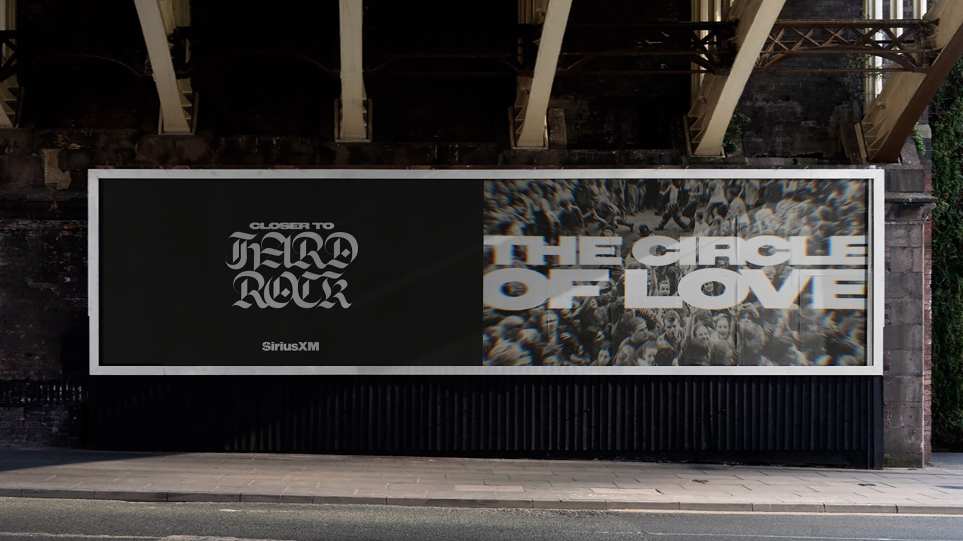
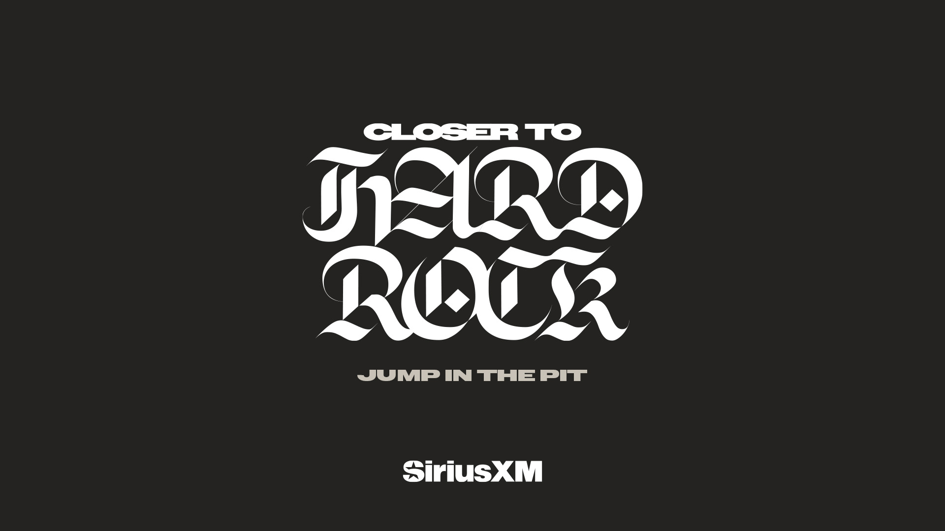
This design system captures the raw energy and spirit of hard rock culture through bold typography, gritty textures, and high-contrast visuals. The layout leverages oversized, heavy fonts paired with cinematic crowd imagery to evoke the intensity of live shows. A desaturated, monochromatic color palette—combined with motion blur and halftone effects—gives the visuals a nostalgic, analog feel that nods to vintage rock posters and broadcast aesthetics. The final composition is both aggressive and immersive, mirroring the unfiltered passion of rock music while maintaining a contemporary edge suited for digital media.
Credits
Created at T&P
Role: Designer & Motion
ECD: Ben Shuttes
CD: Zackery Robbins
Copy: Michael Draper
Missing a credit? Contact me please.
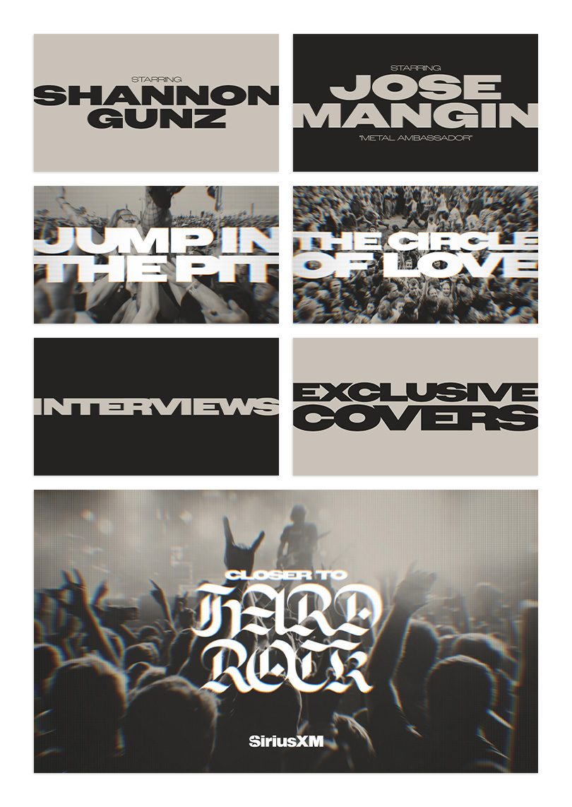
Video
Title cards, text treatments and lower thirds to support video.